Organic Honey Brand Creative Design
Organic Honey Brand Creative Design
Project Overview
Creative design work for an organic honey brand — a product that needed to communicate its natural, pure, and premium qualities through every visual element. The design challenge: make the product feel as authentic, wholesome, and trustworthy as the brand itself.
We used warm earthy tones, natural lighting aesthetics, and clean product-forward layouts to position this brand as the premium choice in a crowded organic food market.
Design Approach
Natural & Premium Aesthetic Organic food brands succeed or fail on how authentic they feel. We chose a warm, natural color palette — honey golds, deep ambers, creamy whites — that immediately communicates purity and quality without saying a word.
Product-First Design The product is the hero. Every design element — background, typography, styling — was chosen to make the honey jar the undeniable focal point of each creative.
Trust Through Visuals We incorporated visual cues that reinforce quality: clean backgrounds, professional product photography direction, and packaging prominently displayed. Consumers buy with their eyes first.
Creative Showcase
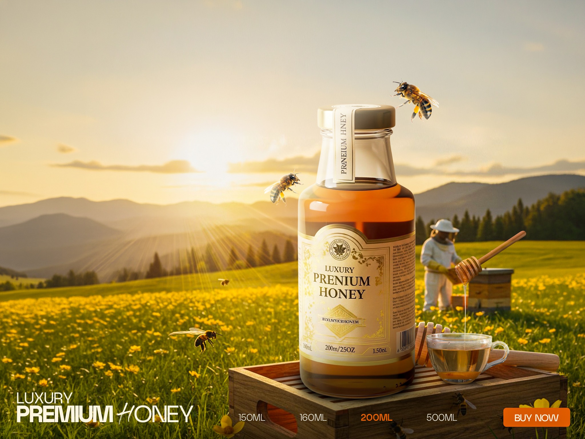
Primary Product Creative — The hero image for this brand campaign. Warm natural light, a clean background, and product-forward framing communicate premium organic quality immediately. Used as the main visual for social media ads and organic posts.
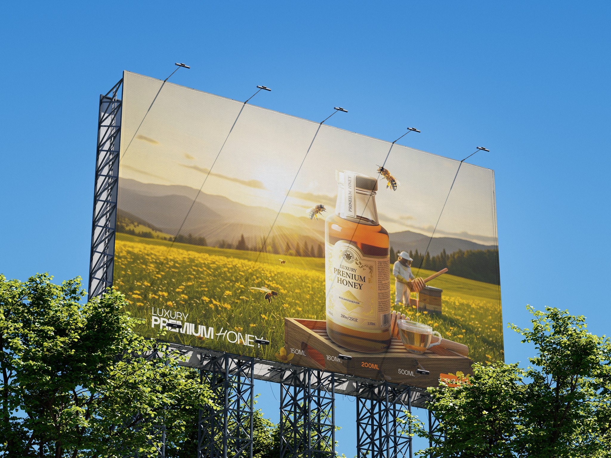
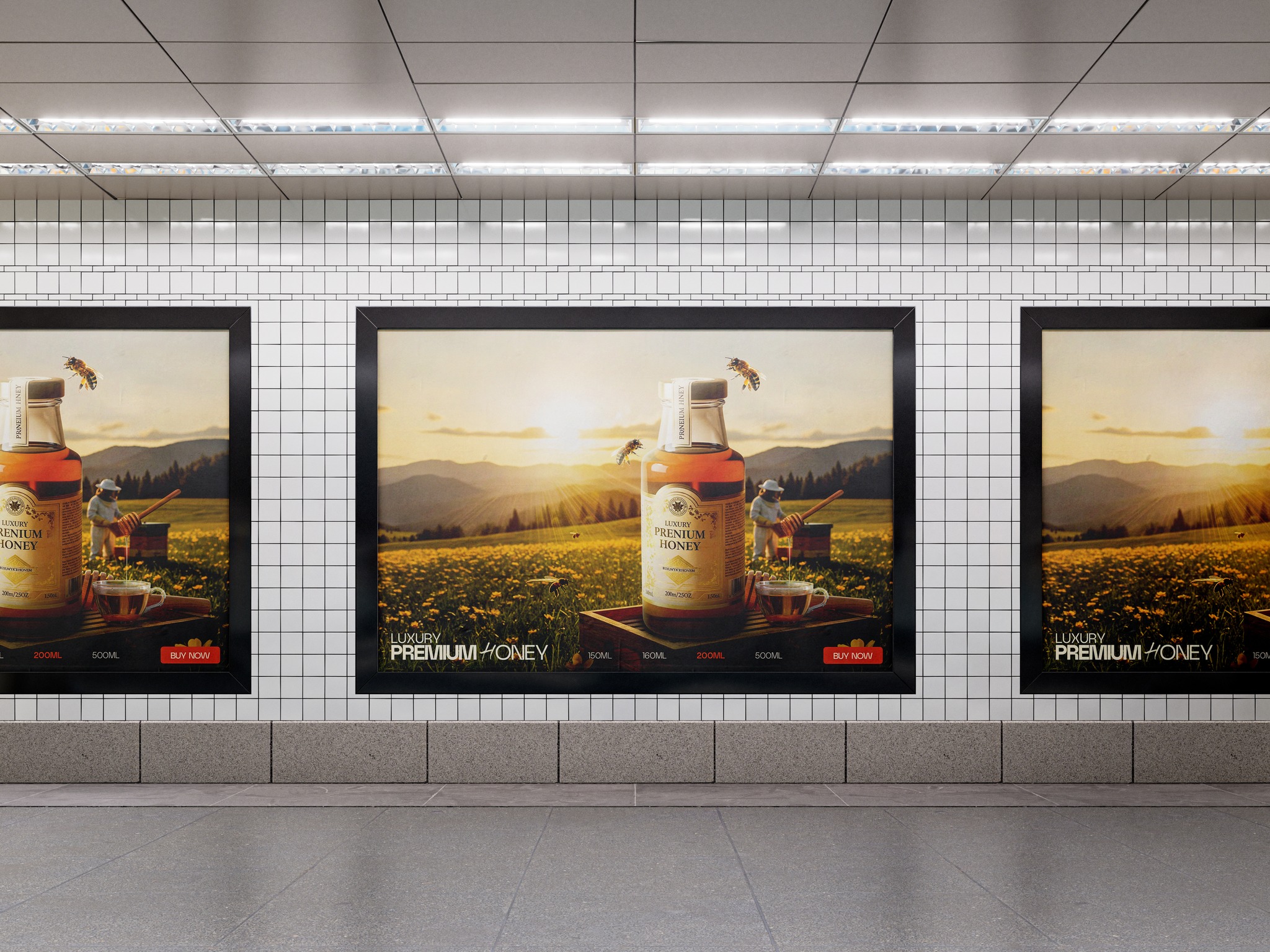 Lifestyle Creative — Product shown in a natural, inviting daily-life context. This creative reinforces the organic, wholesome brand story and makes the product feel desirable and accessible. Ideal for Instagram feed posts and story ads.
 Detail & Texture Creative — A close-up visual highlighting the product’s natural texture, color, and quality. Turns a simple product feature into a compelling visual story that justifies the premium price point.
Why This Design Approach Works for Food Brands
- ✔ Warm color psychology — Gold and amber tones trigger associations with quality, warmth, and natural goodness
- ✔ Clean composition — Uncluttered layouts let the product breathe and speak for itself
- ✔ Authentic feel — Natural lighting avoids the over-produced look that makes audiences skeptical
- ✔ Consistent identity — Three complementary visuals that work together as a cohesive brand story
Project Information
- Client: Organic Food Brand
- Category: Social Media Design
- Start Date: 2026-01-15
- End Date: 2026-02-10
- Project Budget: BDT 10,000
 Previous